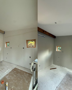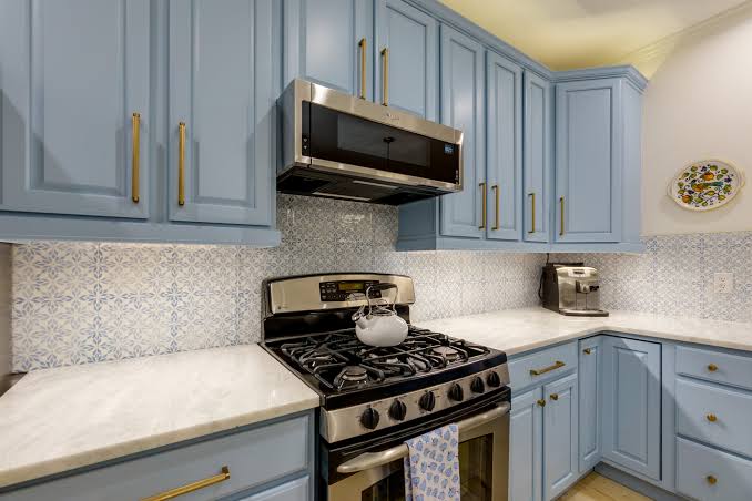

Every painter in Vancouver has had the same conversation. A homeowner falls in love with a color from a photograph or a friend house in California, puts it on all four walls, and hates it by the second week of November. The color was not wrong. The light was different. Understanding how Pacific Northwest light behaves is the difference between a color you live with happily for a decade and one you repaint in eighteen months.
Why Color Behaves Differently Here
For a large share of the year, Clark County sits under overcast skies, and overcast light is cool and diffuse rather than warm and directional. That has two effects. It pushes colors toward their cool undertones, which is why a warm beige can suddenly read yellow or green on your wall, and it flattens contrast, so subtle colors that looked interesting on a sample card go lifeless across a whole room.
Room orientation compounds it. North facing rooms in Vancouver get consistently cool light with no direct sun, and they will make cool colors colder and gray colors bleaker. South facing rooms get the warmest and most usable light we have. East facing rooms are bright in the morning and flat by afternoon, and west facing rooms do the reverse. The same paint in two rooms of the same house can look like two different colors, which is why testing per room rather than per house matters.
How To Test Colors Properly
Paper sample cards are close to useless for a final decision. They are small, they are printed rather than painted, and holding one against an existing wall means you are comparing it to a color it is going to replace. The right approach is larger samples of the actual paint on the actual wall.
Put samples on at least two walls in the room, ideally one that gets the most light and one that gets the least. Look at them in the morning, in the afternoon, and at night under your own lamps, because artificial light shifts color as much as daylight does and most of us are home in the evening. Then live with them for a couple of days before committing. Colors that feel bold and exciting in the first hour often feel like too much by day three, and the reverse happens with quieter shades that grow on you.
One more thing worth doing. Look at the samples with your flooring, your furniture, and your trim in the frame, not in isolation. Those are the elements you are not changing, and they carry undertones the wall color has to live with.
What Tends To Work In Vancouver Homes
Warm whites and soft warm neutrals have largely displaced the cool grays that dominated the last decade, and in this climate that shift makes sense. A cool gray that looks crisp and modern in a bright southern climate can feel cold and flat in a Vancouver living room in January. Warmer whites, greige, and soft warm neutrals hold their character better under overcast light and read as inviting rather than clinical.
Deep colors can work beautifully here, but they need light to carry them. A saturated navy, forest green, or charcoal in a south facing room with good windows can be striking. The same color in a north facing bedroom or a basement den turns the space into a cave for eight months of the year. If you want a deep color in a low light room, consider using it on one wall, or on a smaller space like a powder room or an office where the drama is the point.
Ceilings deserve a decision rather than a default. Standard flat white on the ceiling works in most rooms, but in a space with low ceilings or poor light, going slightly lighter than the walls in the same family often reads better than stark white, which can create a hard visual line and make the ceiling feel lower.
Sheen Matters As Much As Color
The finish you choose changes how the color reads and how the room wears. Flat and matte absorb light, hide wall imperfections best, and suit ceilings and low traffic rooms. Eggshell and satin are the practical choice for most Vancouver living areas, bedrooms, and hallways because they clean up well without highlighting every dent in the drywall. Satin and semi gloss belong in kitchens, bathrooms, and laundry rooms where moisture is constant and surfaces get scrubbed.
The tradeoff is straightforward. Higher sheen means more durability and easier cleaning, but it reflects more light and therefore shows more of whatever is wrong with the wall underneath. On older walls with texture or past repairs, dropping a step in sheen often produces a better looking result than any amount of extra prep.
The Mistakes That Cost The Most
The first is choosing a color from a photograph. Photos are lit, edited, and shot in someone else light, and the room you are looking at is almost never oriented the way yours is.
The second is underestimating how much a dark color costs to apply. Deep and saturated colors, particularly reds, deep blues, and heavily saturated greens, generally need a tinted primer plus two finish coats to reach even coverage. Any contractor promising one coat over a dark accent wall is going to hand you a patchy finish.
The third is forgetting that going back is harder than going forward. Painting over a deep color with a light one takes more coats than the reverse, so a bold choice carries a future cost as well as a present one. That is not a reason to avoid bold colors. It is a reason to be confident before committing four walls to one.
When It Helps To Have Another Opinion
There is no substitute for testing in your own room, but an experienced eye can save you a round of trial and error, particularly on how a shade is likely to behave in a specific orientation and how it will sit next to your existing trim and flooring. Elite Edge Painting works with homeowners on color and sheen selection as part of every interior estimate throughout Vancouver, Camas, and the surrounding Clark County area, and we are happy to tell you when a color is likely to disappoint you across a whole room rather than a two inch square. Call (360) 550-0237 for a free estimate.